| Author |
Message |
Matthew Grzybowski
Industry Professional

|
 Posted: Sun 22 Oct, 2006 3:14 am Post subject: OlliN's Custom Shop Project with Jean Thibodeau Posted: Sun 22 Oct, 2006 3:14 am Post subject: OlliN's Custom Shop Project with Jean Thibodeau |
 |
|
Hello all!
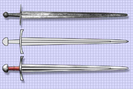
OlliN was approached by myArmoury member Jean Thibodeau about starting a custom shop project he had been thinking about for awhile. We are very excited to be working with Jean on his project. He thought it might be of interest to the forum if we post our production of his custom sword. I thought that was a great idea. To get things started, below is Jean’s original email and the photo he sent to us that we are using to start up the design process.
Jean’s Comments
“Here is my idea at the moment based on the Pontirolo and on the SOSM with a different pommel. The grid is 1" per square so the blade would be 3" wide at the base and 40" long approximately. I would like a fairly thick blade at the guard and distal tapering to no less than 3 mm near the point ( estimate at the moment ) and maybe 5 mm at its thickest: This would be much to heavy with an elliptical grind but might be O.K. with a hollow grind. This is just the railroad engineered starting point. Total weight shouldn't be greater than 5 pounds and the POB should be close to 6" and no more than the 9" of the Pontirolo, but at the weight of 5 pounds a lower POB than 9" would be better. Let me know what you think and if my numbers about weight and dimensions are realistic. Oh, the Pommel is of the very fat Brazilnut close to the Tea cosy type I think or one of the somewhat " Lumpy type ". At this scale the pommel is quite large at 3" across and weight can be adjusted by making it fatter or thinner. The grip should be about 4.5" long, grip thickness to be adjusted/ determined. Any extras ? maybe some lines on the pommel and / or guard i.e. light file work and maybe a few letters or symbols in the fuller. (Simple and sober. Fantasy or historical?).”
We don’t always get such a detailed email for custom shop orders (which is always fine). It was great to get such specifics right of the bat!
Where we are at at the moment is working on sketching out a full size rendering of what Jean has requested. Mark and I are going over the specifics and will be working with Jean through this process. Jean has been a saint right now, because we have been swamped with finishing up a couple of other pieces at the moment. We’re hoping to be sketching here shortly. As we do, look for more posts and pictures of this project during it’s creation.
Best,
Matt
 Attachment: 44.42 KB Attachment: 44.42 KB

OlliN Sword Design
Handmade collectible arms, custom swords, and sculpture
www.ollinsworddesign.com
|
|
   |
 |
|
Chris Lampe
|
 Posted: Sun 22 Oct, 2006 6:16 am Post subject: Posted: Sun 22 Oct, 2006 6:16 am Post subject: |
 |
|
Very cool!
I've been very impressed with Ollin Sword Design's historical recreations so I'm looking forward to watching this project progress.
Keep up the great work!
|
|
   |
 |
Jean Thibodeau

|
 Posted: Sun 22 Oct, 2006 4:57 pm Post subject: Posted: Sun 22 Oct, 2006 4:57 pm Post subject: |
 |
|
I' Il sort of let Matt at OlliN take the lead on this one. The design is still in the early stages but I am fairly set on the general look of the piece, I do see were a lot of the design work is going to have to be in making it handle decently as it is at the extreme end of what can be considered a onehander.
One could say that a much lighter and easy to handle sword might be a better choice in a real fight, but I already have a few of those " reasonable designs ! My Sovereign is for example what i would consider a powerful general purpose cut and thrust sword that is fast and agile and would be the least tiring to use for extended fights.
Now it does help that I can almost handle my A & A 15th century twohander with one hand, at least it's no problem in light dry handling. And this sword is 6 lbs. Being 5' 9" and currently 250 pounds also helps. 
Now even if I was a light 125 lbs and didn't have a hope of handling a 5 lbs sword I might still want a sword that I personally wasn't strong enough to use but could be used by someone stronger. In the same way if I was a billionaire I might collect jet fighter craft even if I could never fly one being very myopic.  
Matt has more drawings from me already that he will post later as I already have some design changes like the hollow grinding on each side of the main fuller being themselves more fuller like and the point only having an elliptical crossection with the 3 fullers fading into the tip.
Balance might be changes a bit to bring the POB closer to the guard: I started the concept with the huge Pontirolo with a POB of 9" but since I am getting further away from this sword I might as well consider tweaking the handling a bit more !?.
Things are looking real good so far as e-mails are answered promptly and the design process is going to be an important and fun part of this project. So dealing with Matt has been AAA  
You can easily give up your freedom. You have to fight hard to get it back!
|
|
  |
 |
Addison C. de Lisle

|
 Posted: Sun 22 Oct, 2006 5:28 pm Post subject: Posted: Sun 22 Oct, 2006 5:28 pm Post subject: |
 |
|
What program are you using to draw the swords?
www.addisondelisle.com
|
|
   |
 |
Jean Thibodeau

|
 Posted: Sun 22 Oct, 2006 6:47 pm Post subject: Posted: Sun 22 Oct, 2006 6:47 pm Post subject: |
 |
|
| Addison C. de Lisle wrote: | | What program are you using to draw the swords? |
Photoshop mostly using the brush tool as an airbrush mostly. Lots of different ways to work with Photoshop.
Matt posted the drawing a bit small so I'll re-post my original a bit bigger to make it easier to see. ( I don't know what software Matt has at his disposal but with Photoshop I can rescale size of pic and resolution easily. )
 Attachment: 62.99 KB Attachment: 62.99 KB
[ Download ]
You can easily give up your freedom. You have to fight hard to get it back!
|
|
  |
 |
|
Russ Ellis
Industry Professional
|
 Posted: Mon 23 Oct, 2006 6:45 am Post subject: Posted: Mon 23 Oct, 2006 6:45 am Post subject: |
 |
|
I cannot wait to see how this one unfolds. I can say that I know first hand that the boys at OlliN do outstanding work, and do not get nearly enough press...
TRITONWORKS Custom Scabbards
|
|
  |
 |
Nathan Robinson
myArmoury Admin


|
|
    |
 |
|
Russ Ellis
Industry Professional
|
 Posted: Tue 24 Oct, 2006 7:07 am Post subject: Posted: Tue 24 Oct, 2006 7:07 am Post subject: |
 |
|
| Nathan Robinson wrote: | | Russ Ellis wrote: | | I cannot wait to see how this one unfolds. I can say that I know first hand that the boys at OlliN do outstanding work, and do not get nearly enough press... |
We could increase their press exposure if one of their customers decided to write an official myArmoury.com hands-on review   |
Dohp!!!  That's a very true statement. Maybe Jean and I can get together for a one two punch on that... That's a very true statement. Maybe Jean and I can get together for a one two punch on that...
TRITONWORKS Custom Scabbards
|
|
  |
 |
|
Jeremy V. Krause
|
 Posted: Tue 24 Oct, 2006 7:33 am Post subject: Posted: Tue 24 Oct, 2006 7:33 am Post subject: |
 |
|
Jean ,
Thanks for sharing your project. I love these in progress threads. Will you be having the letters or symbols inscribed or inlaid into the blade- I vote inlaid- maybe in brass (which would look identical to latten) or maybe iron. Granted I am not paying for your commission so my vote carries little weight still. . . . 
|
|
  |
 |
Matthew Grzybowski
Industry Professional

|
 Posted: Tue 24 Oct, 2006 11:20 am Post subject: Posted: Tue 24 Oct, 2006 11:20 am Post subject: |
 |
|
Thanks very much for the kind words! This project is going to be a lot of fun for us. I know that both Mark and I are excited to start working on it.
I should have an update for this thread tomorrow or Thrusday at the least.
Best,
Matt
OlliN Sword Design
Handmade collectible arms, custom swords, and sculpture
www.ollinsworddesign.com
|
|
   |
 |
Steve Grisetti

|
 Posted: Tue 24 Oct, 2006 3:24 pm Post subject: Posted: Tue 24 Oct, 2006 3:24 pm Post subject: |
 |
|
| Jeremy V. Krause wrote: | Jean ,
Thanks for sharing your project. I love these in progress threads .... |
I second Jeremy's comment, Jean and Matt. Threads like this are a lot of fun to watch, as events unfold, and designs evolve. This particular sword would probably not be a high priority for my own collection, just because of its massive size. However, some of the elements do pique my interest.
"...dismount thy tuck, be yare in thy preparation, for thy assailant is quick, skilful, and deadly."
- Sir Toby Belch
|
|
  |
 |
Jean Thibodeau

|
 Posted: Tue 24 Oct, 2006 8:33 pm Post subject: Posted: Tue 24 Oct, 2006 8:33 pm Post subject: |
 |
|
| Jeremy V. Krause wrote: | Jean ,
Thanks for sharing your project. I love these in progress threads. Will you be having the letters or symbols inscribed or inlaid into the blade- I vote inlaid- maybe in brass (which would look identical to latten) or maybe iron. Granted I am not paying for your commission so my vote carries little weight still. . . .  |
The main focus for now is on the details of the blade profile and giving it as good handling as possible for a very large and heavy one-hander: The use of the second hand could still be used by cupping of hands or maybe the second hand on the pommel. But still, it IS and will remain a one-hander. ( Otherwise I would just have a hand-and-a-half designed and made: Already have a Christian Fletcher with the AT 1435 blade on order, so that option is already covered. )
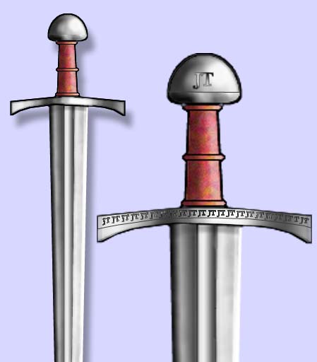
File work or inlays were mentioned in my first e-mail but I haven't decided on anything I might want or if it should be historically or fantasy based ? My only thoughts on it so far might be using stylized J & T in some sort of repeating design or personal symbol i.e. my initials ! The J & T maybe combined into one sign ? These could be on the blade or maybe on the pommel or the sides of the guard. The letters might be hidden in a repeated pattern.
Cost might be a factor if engraved and inlaid or they might be acid etched to produce a continuous pattern on the side of the guard: A lot depends on what is practical and not excessively time intensive. Something like the A & A SoSM engraving but more like an abstract pattern where the letters are readable if one is looking for them but would look like a decorative geometric pattern at a glance. http://www.arms-n-armor.com/view.html?sword145b.jpg
Haven't really discussed this with Matt or Mark yet in any detail. ( But I guess a lot of our back and forth can be happening here in full public eye in real time one could say.    ) ( I can see some discussions might be by private e-mail at least initially if some things should be kept confidential or could be repetitive or boring for a general audience. ) ) ( I can see some discussions might be by private e-mail at least initially if some things should be kept confidential or could be repetitive or boring for a general audience. )
I might do some more Photoshop stuff if / when I get an idea for the engraving or inlays.
You can easily give up your freedom. You have to fight hard to get it back!
|
|
  |
 |
|
Jeremy V. Krause
|
 Posted: Wed 25 Oct, 2006 6:13 am Post subject: Posted: Wed 25 Oct, 2006 6:13 am Post subject: |
 |
|
Yes I like this thread because I get to live vicariously through you Jean!
Well, certainly there is a tremendous cost difference between inlay and engraved/etched. If you don't care about historical authenticity then the inlay could be in copper instead of brass which, though historical, is kind of ugly in my opinion! What are you thinking about for the grip covering? something simple or more ornate?
Jeremy
|
|
  |
 |
Jean Thibodeau

|
 Posted: Wed 25 Oct, 2006 7:11 am Post subject: Posted: Wed 25 Oct, 2006 7:11 am Post subject: |
 |
|
| Jeremy V. Krause wrote: | Yes I like this thread because I get to live vicariously through you Jean!
Well, certainly there is a tremendous cost difference between inlay and engraved/etched. If you don't care about historical authenticity then the inlay could be in copper instead of brass which, though historical, is kind of ugly in my opinion! What are you thinking about for the grip covering? something simple or more ornate?
Jeremy |
For the grip probably wood with the usual cord risers at the ends and maybe in the middle and leather.
Size of the handle should be handfilling but not too thick or wide: I find certain grips like the Gaddhjalt a little too skinny, the Sovereign and Tritonia almost right for me and the A & A Black Prince just about right.
Too small or too big seem more tiring for the hand than when it's just right for yourself.
The engraving again is still an option as simple and clean design also has appeal. Other possibilities like antiquing or bluing of the guard and pommel I haven't done any thinking about as well a scabbard could be a very basic storage " campaign " style: A lot depends on how much I'm comfortable spending and how much I would rather add to the sword.
I'm also debating with myself on integral belt of a baldric considering the weight of the sword ? Historical considerations are secondary since this is in my mind more a fantasy sword but of the more reality based types. ( At least unless I change my mind before the end of the design process ? ) So call it an " Alternate History / Universe - Medieval world " with a little stylistic stealing from the 11th Century to early 15th Century i.e. my current very mature at 56 years old fantasy life.  
Hey if we didn't have a fantasy life we would be fishing or golfing instead of whatever it is we do here. ( No insult intended to those who like fishing or golf.   ) )
You can easily give up your freedom. You have to fight hard to get it back!
|
|
  |
 |
Matthew Grzybowski
Industry Professional

|
 Posted: Sat 28 Oct, 2006 3:56 am Post subject: Update Posted: Sat 28 Oct, 2006 3:56 am Post subject: Update |
 |
|
Here is Jean's revision to the original design that he had sent in and some of his additional thoughts on his piece.
Jean:
Here is an improved, version of the blade bevels: As in the Pontirolo sword there is one deep and narrow fuller. In this version the hollow grind is more like a very shallow fuller on each side of the central fuller regaining a very small and subtle amount of thickness to then become the appleseed secondary bevel.
The outside fullers/ hollow grind transitions into an elliptical section for the point: Again a subtle transition that I have tried to draw accurately but the exact way the transition will look I need Mark to figure out. I think this crossection for the point is better than the highly defined type XVI point I drew in the first version as it is closer in type to the type X of the Pontirolo. I can make an exception with the hollow grinding since the Oakeshott Xa shows that type X could have a different crossection than the more usual elliptical. Apart from really nice aesthetic the design reasons are to have a thicker and more rigid blade than with and elliptical section blade without unduly increasing the weight of the sword.
I've attached a copy of the updated picture that Jean sent us. Lots of great detail here for us to work with. We're should be starting to render within the next couple of weeks.
Best,
Matt
 Attachment: 35.19 KB Attachment: 35.19 KB
[ Download ]
OlliN Sword Design
Handmade collectible arms, custom swords, and sculpture
www.ollinsworddesign.com
|
|
   |
 |
Jean Thibodeau

|
 Posted: Sun 26 Nov, 2006 8:18 pm Post subject: Posted: Sun 26 Nov, 2006 8:18 pm Post subject: |
 |
|
Just a quick update: I should be getting in the mail this week or next a full sized rendering of the sword so that I can approve the design or make some changes ( Minor I would guess ). This should also give me a chance to compare the size of the concept sword to some of my other swords i.e. a reallity check.  
I can also praise Matthew for regular updates and feedback e-mails.
Here are are couple more of my concept drawings:
1) What the engraving might look on guard and pommel using a " standin " font.
2) The actual font JT initials I designed after making the first drawing.
 Attachment: 40.14 KB Attachment: 40.14 KB

 Attachment: 86.81 KB Attachment: 86.81 KB
[ Download ]
You can easily give up your freedom. You have to fight hard to get it back!
|
|
  |
 |
|
Patrick Kelly
|
 Posted: Sun 26 Nov, 2006 9:44 pm Post subject: Posted: Sun 26 Nov, 2006 9:44 pm Post subject: |
 |
|
|
This project has piqued my interest Jean, thanks for the updates. I'm very interested to see how it turns out. I like your concept for the initials.
|
|
   |
 |
Jean Thibodeau

|
 Posted: Sun 26 Nov, 2006 10:12 pm Post subject: Posted: Sun 26 Nov, 2006 10:12 pm Post subject: |
 |
|
| Patrick Kelly wrote: | | This project has piqued my interest Jean, thanks for the updates. I'm very interested to see how it turns out. I like your concept for the initials. |
Thanks for the compliment and I'm also looking forward to holding it and experiencing the " folly " or sense of an extreme design.
The initials are meant to be seen first as a pattern and sneak up on one's perceptions as initials.
( Hidden in full view.   ) )
You can easily give up your freedom. You have to fight hard to get it back!
|
|
  |
 |
|
Geoff Wood
|
 Posted: Mon 27 Nov, 2006 1:57 am Post subject: Posted: Mon 27 Nov, 2006 1:57 am Post subject: |
 |
|
| Jean Thibodeau wrote: |
The initials are meant to be seen first as a pattern and sneak up on one's perceptions as initials.
( Hidden in full view.   ) ) |
I think they work that way on the cross, but not on the pommel (larger size and lack of repetition). Handsome design though.
Geoff
|
|
  |
 |
Jean Thibodeau

|
 Posted: Mon 27 Nov, 2006 2:47 am Post subject: Posted: Mon 27 Nov, 2006 2:47 am Post subject: |
 |
|
| Geoff Wood wrote: | | Jean Thibodeau wrote: |
The initials are meant to be seen first as a pattern and sneak up on one's perceptions as initials.
( Hidden in full view.   ) ) |
I think they work that way on the cross, but not on the pommel (larger size and lack of repetition). Handsome design though.
Geoff |
You're 100% right as the larger pommel one can be seen as initials much more quickly but still has a slight abstract feel to them: In any case that doesn't bother me. For the repeating ones on the guard it's more important that they become a pattern.
The ones on the guard should be etched or engraved while the single one on the pommel might be inlaid with copper.
Not sure yet if the initials should be on both sides of the pommel ? Might be only on one side with the other side plain or the other side might have a Fleur-de-lis done in a similar style or maybe a stylized wolf's head ? ( Just thought of that possibility tonight. )
Hummmmm ....... Yeah, the wolf's head does have some appeal as I used that motif for decorations on the scabbard I had made by Russ Ellis for my Tritonia. ( This is new stuff I haven't discussed with Matthew yet: read it first here.  ) )
Last minute possible change would be to use the wolf's head instead of the initials on the pommel and maybe a fleur-de-lis on the other side? This way the initial on the guard could almost be a " DaVinci Code " sort of thing ?
( I give Nathan credit for making me think of this option.   Decisions pending discussions with Matthew at OlliN. ) Decisions pending discussions with Matthew at OlliN. )
You can easily give up your freedom. You have to fight hard to get it back!
|
|
  |
 |
|
|

