| Author |
Message |
|
William P
|
 Posted: Mon 18 Jan, 2016 11:49 pm Post subject: whats with this mismatched armour (13th C manuscript) Posted: Mon 18 Jan, 2016 11:49 pm Post subject: whats with this mismatched armour (13th C manuscript) |
 |
|

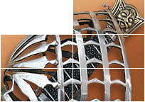
https://www.pinterest.com/pin/358599189058751839/
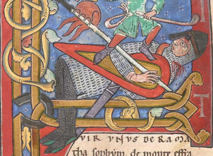
i'm looking at this and trying to understand what i'm looking at here, we hace the pattern that looks like (((((((((((((( showing maille which we see EVERYWHERE in a lot of other psalters and this one, what baffles me ios the other armour that seems to be a flat surface with dots on it.. it's extremely confusing since in this picture it swaps back and forth the hood, cap and bib of the centre man is of identical cut to the man on the right but both are drawn differently, if it was all maille wouldnt it be the same texture i'm not sure what to make oif this being swapped about within the same image.. is the unknown armour type pading? is it maille sandwiched between textiles? it covers the arm of the guy on the right so it can't be plates...
|
|
   |
 |
Dan Howard

|
| Posted: Tue 19 Jan, 2016 2:16 am Post subject: |
|
|
I see an attempt to render several different types of mail using a limited palette while adhering to rigid artistic conventions.
Author: Bronze Age Military Equipment, Pen and Sword Books
|
|
|
|
|
|
Paul Ballantyne
|
| Posted: Tue 19 Jan, 2016 3:32 am Post subject: Maille Gauge |
|
|
Could it be an attempt to depict the different gauge of maille (size of rings) ?
I must admit, its an unusual club the chap second from left is swinging above his head.
|
|
|
|
|
Craig Peters

|
| Posted: Tue 19 Jan, 2016 3:39 am Post subject: |
|
|
|
It's clearly chain mail over top of banded mail. ;-)
|
|
|
|
|
|
William P
|
| Posted: Tue 19 Jan, 2016 4:11 am Post subject: |
|
|
| Dan Howard wrote: | | I see an attempt to render several different types of mail using a limited palette while adhering to rigid artistic conventions. |
the problem is that in one person iot's silver surface with dots on the neck and (((((((((((((((( on the body
and in another it's reversed.. hence my problem is that it isnt consistant from person to person.... how do we explain that?
if it was all one type on bibs and caps and coifs and another on the body... thats easy.. but why would it switch??
|
|
|
|
|
|
Matthew Amt
|
| Posted: Tue 19 Jan, 2016 5:52 am Post subject: |
|
|
Well, it's the Massacre of the Innocents, so those are meant to be either Roman or Herodian soldiers. All sorts of weird things were used to imply an archaic or Biblical setting.
Or it could just be different ways to portray mail!
Matthew
|
|
 |
|
|
Mike Ruhala
Location: Stuart, Florida Joined: 24 Jul 2011
Posts: 335
|
| Posted: Tue 19 Jan, 2016 8:16 am Post subject: |
|
|
|
It looks more like eyelet than mail to me.
|
|
|
|
|
|
Mart Shearer
|
| Posted: Tue 19 Jan, 2016 9:42 am Post subject: |
|
|
| William P wrote: | | Dan Howard wrote: | | I see an attempt to render several different types of mail using a limited palette while adhering to rigid artistic conventions. |
the problem is that in one person iot's silver surface with dots on the neck and (((((((((((((((( on the body
and in another it's reversed.. hence my problem is that it isnt consistant from person to person.... how do we explain that?
if it was all one type on bibs and caps and coifs and another on the body... thats easy.. but why would it switch?? |
I fully agree with Dan, that all of these are meant to depict mail.
Why should it be consistent? It's not like mail was always made of uniform sized rings or wire. Often, the ring sizes vary within a single haubergeon. Likewise, one maker might not use the same size ring or wire profile as another. By 1250 we have rings with round wire and rings with flattened wire as well. A number of miniatures even show the mail on a single figure being rendered in two colors of ink. In the Trinity Apocalypse, the color changes from man to man, and from item to item - coif vs. haubergeon.
 Attachment: 174.63 KB Attachment: 174.63 KB
ferrum ferro acuitur et homo exacuit faciem amici sui
|
|
|
|
|
Dan Howard
|
| Posted: Tue 19 Jan, 2016 12:58 pm Post subject: |
|
|
| Mart Shearer wrote: | | A number of miniatures even show the mail on a single figure being rendered in two colors of ink. In the Trinity Apocalypse, the color changes from man to man, and from item to item - coif vs. haubergeon. |
Everybody knows that brown means leather. It is obviously an attempt to depict leather mail. 
Author: Bronze Age Military Equipment, Pen and Sword Books
|
|
|
|
|
|
Pieter B.
|
| Posted: Tue 19 Jan, 2016 1:26 pm Post subject: |
|
|
| Mart Shearer wrote: | | William P wrote: | | Dan Howard wrote: | | I see an attempt to render several different types of mail using a limited palette while adhering to rigid artistic conventions. |
the problem is that in one person iot's silver surface with dots on the neck and (((((((((((((((( on the body
and in another it's reversed.. hence my problem is that it isnt consistant from person to person.... how do we explain that?
if it was all one type on bibs and caps and coifs and another on the body... thats easy.. but why would it switch?? |
I fully agree with Dan, that all of these are meant to depict mail.
Why should it be consistent? It's not like mail was always made of uniform sized rings or wire. Often, the ring sizes vary within a single haubergeon. Likewise, one maker might not use the same size ring or wire profile as another. By 1250 we have rings with round wire and rings with flattened wire as well. A number of miniatures even show the mail on a single figure being rendered in two colors of ink. In the Trinity Apocalypse, the color changes from man to man, and from item to item - coif vs. haubergeon. |
That arming coat/tabard/medieval graphic t shirt looks quite stiff around the shoulders.
|
|
|
|
|
|
Ralph Grinly
|
| Posted: Tue 19 Jan, 2016 4:49 pm Post subject: |
|
|
|
For my two cent's worth, it's all just artistic licence in showing off plain, ordinary mail. The artist is just trying to make the various parts stand out a bit from each other. No need to go inventing such things as "banded mail," " eyelet mail" or other flights of fancy with no basis in historical reality. I mean..for instance..folks look at the mail shown in the Bayeaux Tapestry and invent all sorts of "different mail" They say."Look..it's in the Tapestry..it must have existed" ..yet they totally ignore the horses that are shown with blue testicles. It's all simple artistic licence..not reality, We totally forget...these illustrations were NOT made to show US today what warriors of the time actually wore. They were made for audiences OF THE DAY to illustrate ( mainly) biblical stories. The audiences /readers THEN knew full well what the artist was showing.
|
|
|
|
|
|
Mike Ruhala
Location: Stuart, Florida Joined: 24 Jul 2011
Posts: 335
|
| Posted: Tue 19 Jan, 2016 11:31 pm Post subject: |
|
|
| Ralph Grinly wrote: | | eyelet mail" or other flights of fancy with no basis in historical reality. |
It existed in historical reality, the only thing that's at all unclear is when it was first developed.
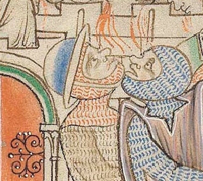
Multiple conventions for depicting mail in artwork certainly were used but William is correct in observing that it's unusual to see more than one being used on any given figure. This image deals with a familiar theme that more clearly shows the use of two different conventions on one figure being used to depict two forms of armor being worn so it's a possibility worth considering in other cases. None of this has anything to do with Meyrick.
Attachment: 13.93 KB
Attachment: 102.06 KB
Attachment: 157.06 KB
[ Download ]
|
|
|
|
|
|
Mart Shearer
|
| Posted: Wed 20 Jan, 2016 7:40 am Post subject: |
|
|
| Mike Ruhala wrote: | | Multiple conventions for depicting mail in artwork certainly were used but William is correct in observing that it's unusual to see more than one being used on any given figure. |
I agree it's more usual to show mail all the same on the same figure, though it's not uncommon to see different methods used on multiple soldiers in a single miniature. There are a number of figures where the method of showing mail is the same, but the color varies between chausses and haubergeon. The Goliath in the Parc Abbey Bible, BL Additional 14789 fo.10r, has both differing color and techniques used on the haubergeon and chausses, so it's not unique.
http://www.bl.uk/manuscripts/Viewer.aspx?ref=add_ms_14789_f010r
Attachment: 92.77 KB
ferrum ferro acuitur et homo exacuit faciem amici sui
|
|
|
|
|
|
William P
|
| Posted: Wed 20 Jan, 2016 8:00 am Post subject: |
|
|
| Mart Shearer wrote: | | William P wrote: | | Dan Howard wrote: | | I see an attempt to render several different types of mail using a limited palette while adhering to rigid artistic conventions. |
the problem is that in one person iot's silver surface with dots on the neck and (((((((((((((((( on the body
and in another it's reversed.. hence my problem is that it isnt consistant from person to person.... how do we explain that?
if it was all one type on bibs and caps and coifs and another on the body... thats easy.. but why would it switch?? |
I fully agree with Dan, that all of these are meant to depict mail.
Why should it be consistent? It's not like mail was always made of uniform sized rings or wire. Often, the ring sizes vary within a single haubergeon. Likewise, one maker might not use the same size ring or wire profile as another. By 1250 we have rings with round wire and rings with flattened wire as well. A number of miniatures even show the mail on a single figure being rendered in two colors of ink. In the Trinity Apocalypse, the color changes from man to man, and from item to item - coif vs. haubergeon. |
actually the trinity is what i EXPECT depictions of maille to be aka the consistant series of (((( symbols showing the links...and theyre all drawn the same way on coif, body or leg... colour changes but then people wear differenct coloured pants to their tunic... (maybe it'spaint or even colouring via bluing and heat... so it could be anything...)
the trinity shows a cnsistant artistic convention from person to person...
i suppose it feels bizzare on part of the artist... why go to the effort of swapping when you can do all the bodies one tone and all the coifs another 'texture'(i say texture since i see it as trying to depict a texture of say, maille on a 2d surface)
using two different looks to differentiate coifs and one for haubergons makes sense
if it was between different manuscripts, or even different pages i figure yeah artistic liscence and artistic convention saying 'this is neck this is body'
its the fact the convention/ 'code' was switched around for different people on the same PAGE, is what makes my head spin....
maybe he got lazy and decided i cant be bothered drawing all these squiggles i'm gonna do dots now....
interestingly manuscriptminiatures website has a tag for 'maille coif' and one for 'mail coif - dotted'
my personal favorite convention of drawing maille is in japan for kusari with a cross hatch pattern, which, is meant to show maille but is why directors show ninja with fishnet clothing under their kimono
Last edited by William P on Wed 20 Jan, 2016 8:46 am; edited 1 time in total
|
|
|
|
|
|
Mike Ruhala
Location: Stuart, Florida Joined: 24 Jul 2011
Posts: 335
|
| Posted: Wed 20 Jan, 2016 8:00 am Post subject: |
|
|
|
I'm aware of images like that but the trick is we don't have a way to know for sure if they're trying to represent something other than mail or not. I've seen the little circles as in the image you just posted before and I agree that probably is meant to be mail, the construction of the chausses suggests it but by the same token there's no reason you couldn't fasten eyelet chausses in the same manner and odds are if they were used they'd follow the same basic pattern as mail chausses would. As far as color goes as I've mentioned before 3227.a contains a recipe for case hardening mail that would result in in a blackened appearance, even multi-colored depending on how it was done. In any case early eyelet is unproven and may be impossible to prove but my gut tells me most of the conventions we see are mail including the little circles as with the chausses here but the dots *may* be eyelet or something similar.
|
|
|
|
|
|
Mart Shearer
|
|
|
|
|
|
Andrew Gill
|
| Posted: Thu 21 Jan, 2016 12:12 am Post subject: |
|
|
A question: how certain can we be that a specific illustration in a manuscript was produced by only one artist? I know that by the renaissance, most of the famous artists sketched out the main design and perhaps did the "fiddly bits" and final finishing, but had groups of apprentices who would do most of the actual painting. I can easily imagine a similar division of labour being applied to the more laborious details of an illustration in a manuscript (ie the master illustrator draws the outlines, and his apprentices have to draw in the mail, and each chooses a different approach), but is there any actual evidence for this?
Of course, a single illustrator could varied the pattern to make the picture more interesting, as others have suggested, or he could have been under time pressure and chosen a simpler pattern, or maybe he just got bored.
|
|
|
|
|
Dan Howard
|
| Posted: Thu 21 Jan, 2016 1:41 am Post subject: |
|
|
Exactly. It is impossible to use the various illustrations to pick out differences in armour characteristics without first proving that they were all done by the same artist.
Author: Bronze Age Military Equipment, Pen and Sword Books
|
|
|
|
|
|
Alan E
|
| Posted: Thu 21 Jan, 2016 3:28 am Post subject: |
|
|
Somewhere, someone said these pictures were not produced to guide us as to what was worn and how it was made. They were produced as interesting illustrations, sometimes related to the subject matter, or else just interesting marginalia.
They were produced according to conventions yes, but the conventions gave the illustrators choices about what to use to illustrate mail, metal etc. Choosing which convention to use on what was subject to constraints: Not of consistently showing the same thing the same way (as we might for a catalog for example), but of making the picture interesting. Not only is the potential boredom of the artist to be considered, but his (usually) desire to make the picture interesting for his patron(s). Add to that the potential desire to make Herod's child-slayers uncouth with mis-matched gear (even if it is all mail) and there is no need to reach further for why each figure has different 'textures' to their figures.... Say  is that a chain-mail helmet on the central figure? It has a brim (single, not bands) but the same texture as the aventail/coif! is that a chain-mail helmet on the central figure? It has a brim (single, not bands) but the same texture as the aventail/coif! 
Member of Exiles Medieval Martial Arts.
Currently teaching Fiore's art in Ceredigion
|
|
|
|
|
|
|