| Author |
Message |
Kirk Lee Spencer

|
 Posted: Wed 09 Dec, 2009 2:53 pm Post subject: Cervenka Pommel Posted: Wed 09 Dec, 2009 2:53 pm Post subject: Cervenka Pommel |
 |
|
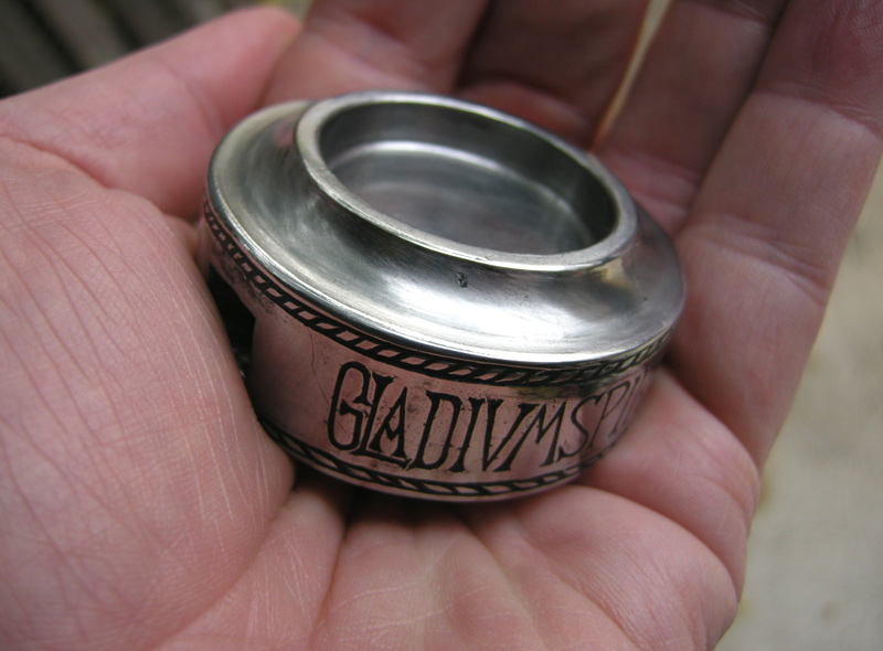
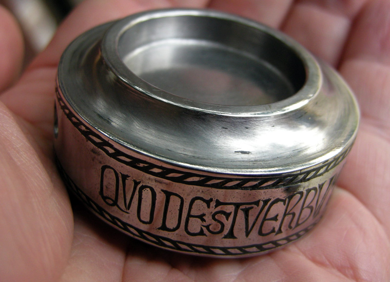
Hi All...
Just wanted to show you a pommel that Vlad Cervenka has made for me.
He has been doing some excellent work lately. He has made two beautiful swords for me that are in the review que here at myArmoury. Until they are unveiled, this pommel should show the quality of his work.
take care
ks
 Attachment: 148.35 KB Attachment: 148.35 KB
Two swords
Lit in Eden’s flame
One of iron and one of ink
To place within a bloody hand
One of God or one of man
Our souls to one of
Two eternities
|
|
  |
 |
Maurizio D'Angelo

|
| Posted: Wed 09 Dec, 2009 3:30 pm Post subject: |
|
|
hi Kirk,
the incisions are made by hand.
I love the manual labor ...
I hope not blackened with paint ... distorts the excellent work done. 
Ciao
Maurizio
|
|
 |
|
|
Daniel Sullivan
|
| Posted: Wed 09 Dec, 2009 3:32 pm Post subject: Pommel |
|
|
Kirk,
Really nice work. Wheel pommels are my real weak spot.
Happen to run across some work you did sometime back. It was a redo or rather a salvation of an MRL Irish hand and a half sword. Made a bum decision a few years ago and picked one up. Until I saw your posts, Had intentions of getting rid of it, but your postings changed my mind. Now I'm thinking about trying to follow your lead.
Cheers,
Dan
|
|
|
|
|
Roger Hooper

|
| Posted: Thu 10 Dec, 2009 4:01 pm Post subject: |
|
|
I can envision a ritual where (after it has been mounted on a hilt) a precious liquid/liquor is drunk from that deep pommel recess. 
|
|
|
|
|
Scott S.

|
| Posted: Thu 10 Dec, 2009 5:03 pm Post subject: |
|
|
| Roger Hooper wrote: | | I can envision a ritual where (after it has been mounted on a hilt) a precious liquid/liquor is drunk from that deep pommel recess. |
...and Bacardi 151 would be involved and they would be called "Flaming Pommel Shots" and I would charge $8 per at my amazingly successful Medieval-themed nightclub called "Oakeshott's."
....Sorry, got kind of excited by the idea!
EDIT: I'm sorry Roger, OUR amazingly successful nightclub.
|
|
|
|
|
Kirk Lee Spencer
|
| Posted: Fri 11 Dec, 2009 6:58 am Post subject: |
|
|
| Maurizio D'Angelo wrote: | hi Kirk,
the incisions are made by hand.
I love the manual labor ...
I hope not blackened with paint ... distorts the excellent work done.
Ciao
Maurizio |
Hi Maurizio.
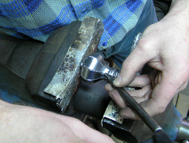
You're right, Vlad did it all by hand. I have attached a really great picture Vlad sent awhile back showing how he does his engraving. He must have fantastic eyesight! 
Keep in mind that the images of his engraving I posted are (at 1024x800) more than twice the size of the pommel itself. This means that the engraving is magnified on the screen. So any slight flaws will be really obvious in the picture which would not be obvious when viewed in hand without any magnification. In short, even with magnification his work is almost flawless, it looks even better in hand.
And when I say flawless I don't mean that there are not deviances, there certainly are differences in the lettering. But all the differences add to the humanness or "hand made" look of the piece. It is a characteristic that I admire in Vlad Cervenka's work. It is hard to describe. I tend to think of it as "fluidity" (the flow of the work of a true artist.) When I am working on a piece I have to concentrate and obsess and then I make mistakes and then I patch up my mistakes and try it again. It takes me many, many hours to do what a trained professional could do in a matter of minutes because I lack the experience or maybe even skill to do it right the first time. Someone who is well trained can move through the task with a fluidity that adds to the beauty and humanness of a work of art. I think that this characteristic is recognizable to the trained eye. (And such "fluidity" also allows you to make more per hour which makes you more money.)
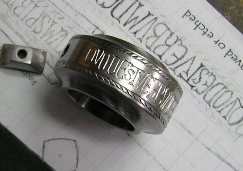
As for the blackening in the lettering. I am not sure what it is. It has kind of a hard waxy consistency. I have never seen niello up close, but this material is about what I envision it would look like.
I once had a similar belief that someone might fill up an engraving with niello or some other substance to cover over all the mistakes. In discussion with a very accomplished engraver, he told me that, actually, filling an engraving is much more likely to shows all the imperfections along the edges rather than covering them. I have posted an in-process picture of the engraving that shows it does look good without the blackening also. However, I think I like the more polished smooth surfaces of the piece with the blackening...
Thanks for the input
take care
ks
Attachment: 148.13 KB
Attachment: 70.51 KB
Attachment: 142.48 KB
Two swords
Lit in Eden’s flame
One of iron and one of ink
To place within a bloody hand
One of God or one of man
Our souls to one of
Two eternities
|
|
|
|
|
Kirk Lee Spencer
|
| Posted: Fri 11 Dec, 2009 7:04 am Post subject: Re: Pommel |
|
|
| Daniel Sullivan wrote: | Kirk,
Really nice work. Wheel pommels are my real weak spot.
Happen to run across some work you did sometime back. It was a redo or rather a salvation of an MRL Irish hand and a half sword. Made a bum decision a few years ago and picked one up. Until I saw your posts, Had intentions of getting rid of it, but your postings changed my mind. Now I'm thinking about trying to follow your lead.
Cheers,
Dan |
Hey Dan...
Yeah, I like wheel pommels too. This is a pommel that I have been thinking about for quite some time. When it is finished, I want it to be a work of art in it's own right.
I have my Irish (Narsil) ring sword in my office and so I pick it up ever so often. I really like how it feels in motion, it has a really nice balance.
take care
ks
Two swords
Lit in Eden’s flame
One of iron and one of ink
To place within a bloody hand
One of God or one of man
Our souls to one of
Two eternities
|
|
|
|
|
Kirk Lee Spencer
|
| Posted: Fri 11 Dec, 2009 7:07 am Post subject: |
|
|
| Roger Hooper wrote: | | I can envision a ritual where (after it has been mounted on a hilt) a precious liquid/liquor is drunk from that deep pommel recess. |
Roger and Scott...
I agree it does look like a cup. or a medieval shot glass of sorts. Let me know when you get the nightclub up and running  . .
The reason it has such a deep recess is that it will eventually be a reliquary...just need to find an ancient relict to fill it.
take care
ks
Two swords
Lit in Eden’s flame
One of iron and one of ink
To place within a bloody hand
One of God or one of man
Our souls to one of
Two eternities
|
|
|
|
|
Scott S.
|
| Posted: Fri 11 Dec, 2009 7:12 am Post subject: |
|
|
That really is one beautiful pommel and I always appreciate seeing work-in-progress pictures as well.
So...what does the inscription say? What's the "story" behind it?
|
|
|
|
|
Maurizio D'Angelo
|
| Posted: Fri 11 Dec, 2009 10:55 am Post subject: |
|
|
| Kirk Lee Spencer wrote: |
And when I say flawless I don't mean that there are not deviances, there certainly are differences in the lettering. But all the differences add to the humanness or "hand made" look of the piece. It is a characteristic that I admire in Vlad Cervenka's work. It is hard to describe. I tend to think of it as "fluidity" (the flow of the work of a true artist.) When I am working on a piece I have to concentrate and obsess and then I make mistakes and then I patch up my mistakes and try it again. It takes me many, many hours to do what a trained professional could do in a matter of minutes because I lack the experience or maybe even skill to do it right the first time. Someone who is well trained can move through the task with a fluidity that adds to the beauty and humanness of a work of art. I think that this characteristic is recognizable to the trained eye.
ks |
If you try to affect steel, with a punch, you can immediately understand how difficult it is. I'm trying for months, is really difficult. For me the difficulty lies in the depths of character, the bottom surface is not smooth like in your pommel, but full of small furrows. Vlad Cervenka is a great artist.
Ciao, Kirk
Maurizio
|
|
|
|
|
Stephane Rabier

|
| Posted: Sat 12 Dec, 2009 12:49 am Post subject: |
|
|
| Scott S. wrote: |
So...what does the inscription say? What's the "story" behind it? |
Hi,
I guess that's Paul to Ephesians VI:14-17: Gladium spiritus quod est verbum Dei "the sword of spirit which is the word of God" (sorry for my poor English).
Nice work, I love the irregular style of old Roman texts.
|
|
|
|
|
Paul Hansen

|
| Posted: Sat 12 Dec, 2009 12:49 pm Post subject: |
|
|
|
Really nice work!
|
|
|
|
|
Roger Hooper
|
| Posted: Sat 12 Dec, 2009 1:04 pm Post subject: |
|
|
I'm curious ab out the small s in Quod Est Verbum Dei.
Is it a stylisltic thing, or is it an intentional setup where the engraver has forgotten to put the S in est and then somehow manages to shoehorn it in? I'm not implying that Cervenka made a mistake here.
|
|
|
|
|
Nathan Robinson
myArmoury Admin


|
|
 |
|
Roger Hooper
|
| Posted: Sat 12 Dec, 2009 1:35 pm Post subject: |
|
|
| Nathan Robinson wrote: |
Looks intentional, as it appears in the drawing, too.
|
Yes, but why was it done that way originally? I notice that the same thing was done with the A in gladium. An artisitc choice? A way to save some space?
It is very attractive to the eye.
|
|
|
|
|
Stephane Rabier
|
| Posted: Sat 12 Dec, 2009 2:09 pm Post subject: |
|
|
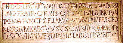
Hi,
that style is very common in old Roman texts, just try a Google picture search with "roman inscriptions" and you'll see a lot of similar irregular writing.
Attachment: 16.97 KB
|
|
|
|
|
Kirk Lee Spencer
|
| Posted: Sat 12 Dec, 2009 5:12 pm Post subject: |
|
|
| Scott S. wrote: | That really is one beautiful pommel and I always appreciate seeing work-in-progress pictures as well.
So...what does the inscription say? What's the "story" behind it? |
Hey Scott...
Stephane is exactly right.
It is passage from the Latin Vulgate appropriate for a reliquary on a sword... IMHO.
I am in the process of planning a relic for the reliquary... something related to St. Prisca I think.
And since I am making it, it can be quite miraculous.
take care,
ks
Two swords
Lit in Eden’s flame
One of iron and one of ink
To place within a bloody hand
One of God or one of man
Our souls to one of
Two eternities
|
|
|
|
|
Kirk Lee Spencer
|
| Posted: Sat 12 Dec, 2009 5:23 pm Post subject: |
|
|
| Stephane Rabier wrote: | | Scott S. wrote: |
So...what does the inscription say? What's the "story" behind it? |
Hi,
I guess that's Paul to Ephesians VI:14-17: Gladium spiritus quod est verbum Dei "the sword of spirit which is the word of God" (sorry for my poor English).
Nice work, I love the irregular style of old Roman texts. |
Hi Stephane...
Yeah, I like the old Roman style too. So much in fact I used it even though it's popularity was probably at least two centuries earlier then this type of wheel pommel. But this script is easier to read and since a St. Prisca relic would be from Roman times, it seems to fit nicely.
Take care,
ks
Two swords
Lit in Eden’s flame
One of iron and one of ink
To place within a bloody hand
One of God or one of man
Our souls to one of
Two eternities
|
|
|
|
|
Kirk Lee Spencer
|
| Posted: Sat 12 Dec, 2009 6:20 pm Post subject: |
|
|
| Roger Hooper wrote: | | Nathan Robinson wrote: |
Looks intentional, as it appears in the drawing, too.
|
Yes, but why was it done that way originally? I notice that the same thing was done with the A in gladium. An artisitc choice? A way to save some space?
It is very attractive to the eye. |
Hi Roger...
Nathan's right, it was not a mistake... And Stephane's right in that it is common on Roman inscriptions.
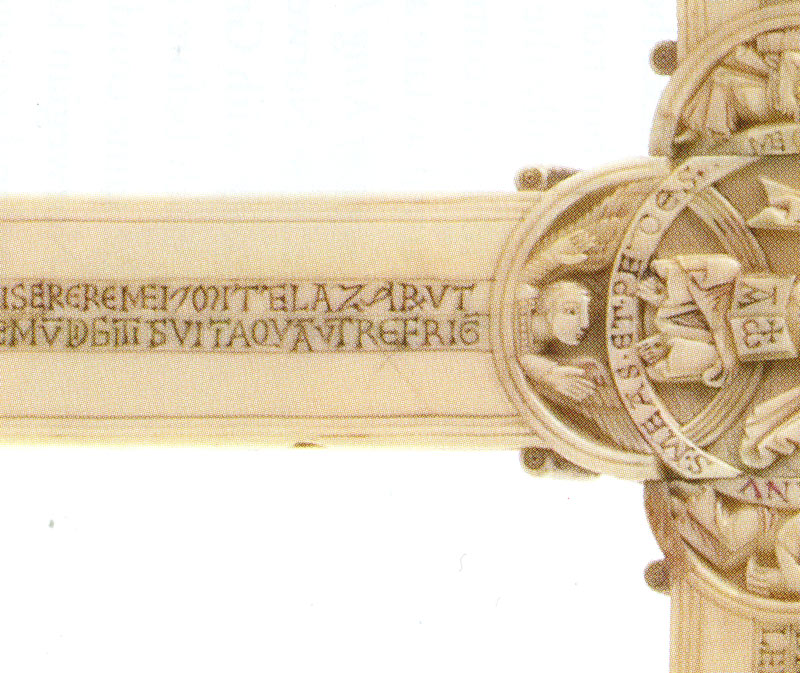
Not sure why it was done. However, the fact that it was done came in handy when I had to fit such a long inscription on the sides of a pommel. In short, I did not have quite enough room without making the letters really tall and thin.
So knowing that Roman inscriptions often had these diminished letters, I began to look for places where, when every other letter was pulled together, would create a gap or space between the letters for the intervening letter to fit when diminished. I found four places where this could be done. And in doing so I saved the width of four letters. There are also a few areas where I could also overlap letters slightly to pack them in as close as possible. Doing this I was able to get all the letters in the space and make them as large as possible. I was very pleased with the look. To my eye it makes the script so alive. Not the sterile regiment of letters we normally see. This moving organic aspect also highlights the "vine-like" quality of the letters. And so you are right too IMO... It is very attractive to the eye.
I have attached detail of an inscription from the beautiful gunhild's Cross. It is dated to about 1150. You can see at least one diminished letter and several that overlap.
take care,
ks
Attachment: 149.92 KB
Two swords
Lit in Eden’s flame
One of iron and one of ink
To place within a bloody hand
One of God or one of man
Our souls to one of
Two eternities
|
|
|
|
|
David Etienne

|
| Posted: Mon 14 Dec, 2009 12:19 pm Post subject: |
|
|
Hello Kirk,
Thank you for posting these pictures! I don't want to hijack your trade, but I just want to say that Vladimir Cervenka is not only a very talented swordsmith, he's also an extremely kind person and it's a dream to work with him. My first custom sword was just made by him and it's currently en route to my address. Vladimir answered to every mail I sent him in the next 12 hours max. and he was very helpful as well as kind enough to send me pictures of his work in progress. I will post my own thread about this sword as soon as possible.
Cheers,
David
P.S. By the way, it's your reviews about your swords from Vladimir that decided me to order him a custom sword ;-)
|
|
|
|
|
|
|