| Author |
Message |
|
Patrick Kelly
|
 Posted: Fri 25 Jun, 2004 7:38 pm Post subject: John Lundemo/Adrian Ko collaboration......... Posted: Fri 25 Jun, 2004 7:38 pm Post subject: John Lundemo/Adrian Ko collaboration......... |
 |
|
I saw this over on SFI.

Apparently this is a joint effort between John and Adrian, utilizing an Atrim blade.
I think the grip is a little thick. A narrower grip would help the flow of the swords aesthetic line, and I don't care for a mirror polish. However, these are just issues of personal preference. The etching is very nicely done. Overall I think it's a very nice effort.
The overall line of the sword looks very much like XIIIa.5 on page 101 of Oakeshotts Records of the Medieval Sword. I've always liked the look of that one.
Here's the complete thread:
http://forums.swordforum.com/showthread.php?s...adid=37110
"In valor there is hope.".................. Tacitus
|
|
   |
 |
|
Brian M
Location: Austin, TX Joined: 30 Sep 2003
Posts: 500
|
 Posted: Fri 25 Jun, 2004 10:32 pm Post subject: Posted: Fri 25 Jun, 2004 10:32 pm Post subject: |
 |
|
Kinda looks like the blade is a hex-section.
Regards,
Brian M
|
|
  |
 |
|
Patrick Kelly
|
 Posted: Sat 26 Jun, 2004 12:12 am Post subject: Posted: Sat 26 Jun, 2004 12:12 am Post subject: |
 |
|
| Brian M wrote: | Kinda looks like the blade is a hex-section.
Regards,
Brian M |
It is indeed.
"In valor there is hope.".................. Tacitus
|
|
   |
 |
Lee Watts

Location: Wales, UK ,europe Joined: 25 Aug 2003
Posts: 144
|
 Posted: Sat 26 Jun, 2004 3:29 am Post subject: Posted: Sat 26 Jun, 2004 3:29 am Post subject: |
 |
|
|
looks a bit like the Next Gen Barron, Patrick any idea what the inscriptions say? my eyes are playing up today.
|
|
    |
 |
|
Steve Fabert
|
 Posted: Sat 26 Jun, 2004 4:12 am Post subject: Posted: Sat 26 Jun, 2004 4:12 am Post subject: |
 |
|
| Lee Watts wrote: | | looks a bit like the Next Gen Barron, Patrick any idea what the inscriptions say? my eyes are playing up today. |
Looks like "Militaris Templi" when I blow the picture up in my favorite graphics program.
|
|
  |
 |
|
Joel Chesser
|
 Posted: Sat 26 Jun, 2004 7:52 am Post subject: Posted: Sat 26 Jun, 2004 7:52 am Post subject: |
 |
|
That's what it looks like it says to me.
..." The person who dosen't have a sword should sell his coat and buy one."
- Luke 22:36
|
|
  |
 |
|
Patrick Kelly
|
 Posted: Sat 26 Jun, 2004 10:45 am Post subject: Posted: Sat 26 Jun, 2004 10:45 am Post subject: |
 |
|
| Lee Watts wrote: | | looks a bit like the Next Gen Barron, Patrick any idea what the inscriptions say? my eyes are playing up today. |
Steve's right about the inscription. I believe that Adrian is calling this one the Templar Knight Commander.
Actually, other than being a H&H design of the high middle ages the two swords (compared to the Baron) have little in common. This one really looks nearly dead-on when compared to XIIIa.5 in Records. The Baron is a straight up Oakeshotts type XIIa. The overall shape and proportion of the whole sword, as well as the individual components, is quite different.
"In valor there is hope.".................. Tacitus
|
|
   |
 |
David Stokes

|
 Posted: Sat 26 Jun, 2004 2:21 pm Post subject: Posted: Sat 26 Jun, 2004 2:21 pm Post subject: |
 |
|
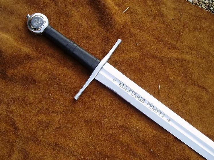
a note about the grip being thick, it actually is not thick, probably a trick of the light, but compared to other atrims, and albions ive handled, its right in there.
the BAD picture doesnt show it, but the grip actually has a hex cross section, wrapped with cord , bands under it, and then leather covered.
 Attachment: 99.83 KB Attachment: 99.83 KB
|
|
  |
 |
David Stokes

|
 Posted: Sat 26 Jun, 2004 2:23 pm Post subject: Posted: Sat 26 Jun, 2004 2:23 pm Post subject: |
 |
|
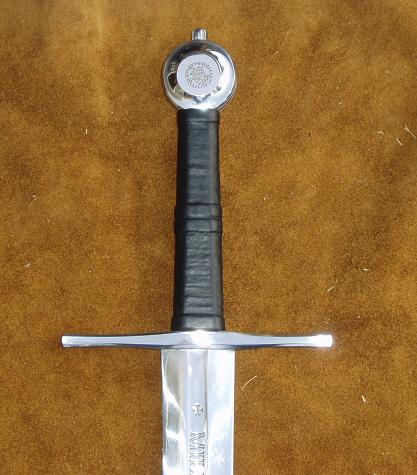
even in that picture shadows play tricks, but in this one prehaps a bit better size is determined.
 Attachment: 39.36 KB Attachment: 39.36 KB
|
|
  |
 |
David Stokes

|
 Posted: Sat 26 Jun, 2004 2:25 pm Post subject: Posted: Sat 26 Jun, 2004 2:25 pm Post subject: |
 |
|
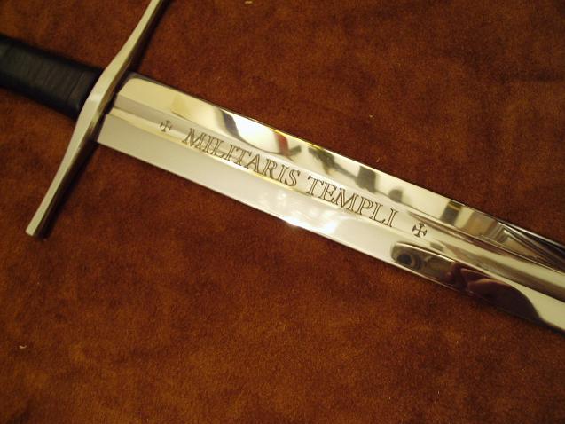
The etchings.
 Attachment: 42.75 KB Attachment: 42.75 KB
|
|
  |
 |
|
Patrick Kelly
|
 Posted: Sat 26 Jun, 2004 2:44 pm Post subject: Posted: Sat 26 Jun, 2004 2:44 pm Post subject: |
 |
|
Not to be picky but..............*g*
I didn't say that the grip was too thick, as in terms of design. I said that it was too thick in accordance with my personal taste, which I still feel it is. A slightly narrower grip would compliment the shape of the guard and pommel instead of overpowering it.
Like I said though, just personal taste.
"In valor there is hope.".................. Tacitus
|
|
   |
 |
David Stokes

|
 Posted: Sat 26 Jun, 2004 2:51 pm Post subject: Posted: Sat 26 Jun, 2004 2:51 pm Post subject: |
 |
|
ah i see, My misunderstanding, I see what you mean.
Well, I wasnt saying it was perfect.... Nor was i saying it was better than anything else out there, nor was i saying THIS IS WHAT JOHN DOES.......... any design stuff i guess can be blamed on Adrian ! *grin* hehehehehe
|
|
  |
 |
Timothy Gulics

|
 Posted: Sat 26 Jun, 2004 3:30 pm Post subject: Posted: Sat 26 Jun, 2004 3:30 pm Post subject: |
 |
|
A very cool sword. Very pricey, too.
The sword is my companion.
|
|
       |
 |
|
Chris Holzman
|
 Posted: Sat 26 Jun, 2004 10:54 pm Post subject: Posted: Sat 26 Jun, 2004 10:54 pm Post subject: |
 |
|
| Patrick Kelly wrote: | Not to be picky but..............*g*
I didn't say that the grip was too thick, as in terms of design. I said that it was too thick in accordance with my personal taste, which I still feel it is. A slightly narrower grip would compliment the shape of the guard and pommel instead of overpowering it.
Like I said though, just personal taste. |
Patrick,
Agreed. I think my personal preference would be for the leather at each end of the grip to not be any wider than the width of the pommel/cross.. I think it throws the aesthetic a bit off of what I'd want.. IF the leather ever started to wear, it'd probably be on that area 'around the corner' where it wouldn't be supported or butted up against the guard or pommel.
on the whole though, its really rather nice. I like the mirrored finish - in a certain gaudy way it screams 'presentation sword' to me, and I like that a lot.
Nice to see non fantasy work from John. Also neat to see an Atrim blade in a realllllly high level of polish.
Chris Holzman
River City Fencing Club
Wichita, KS
|
|
  |
 |
David Stokes

|
 Posted: Sun 27 Jun, 2004 6:08 am Post subject: Posted: Sun 27 Jun, 2004 6:08 am Post subject: |
 |
|
just a note about the polish, when i received the sword for review, i was impressed by the overall polish John did, but at the same time, im like you, it seemed too showy to use, I would be affraid to cut with this sword for fear of scratching it!!
its really TOO pretty to cut with, even though the way it feels in hands screams of a excellant cutter.
Originally the design called for the sword to be "antiqued" but the purchaser wanted a higher level finish....... its his sword, his choice.........
|
|
  |
 |
|
Lee O'Hagan
|
 Posted: Sun 27 Jun, 2004 8:06 am Post subject: Posted: Sun 27 Jun, 2004 8:06 am Post subject: |
 |
|
John,Gus,Adrian,
Nice work guy's,
Nice pics David,
Tim,
I guess you've asked what this cost direct,
does it still seem pricey if you do the hours-dollars sums,
Be interested in your thoughts,pm might be more appropriate though,  , ,
Patrick,
If the leather collar/swell nearest the pommell and guard was'nt there,so it would appear to taper in more,is that what your saying you prefer ?,or do you mean actually thinner overall ? cheers.
|
|
  |
 |
|
Patrick Kelly
|
 Posted: Sun 27 Jun, 2004 8:07 am Post subject: Posted: Sun 27 Jun, 2004 8:07 am Post subject: |
 |
|
| David Stokes wrote: | just a note about the polish, when i received the sword for review, i was impressed by the overall polish John did, but at the same time, im like you, it seemed too showy to use, I would be affraid to cut with this sword for fear of scratching it!!
its really TOO pretty to cut with, even though the way it feels in hands screams of a excellant cutter.
Originally the design called for the sword to be "antiqued" but the purchaser wanted a higher level finish....... its his sword, his choice......... |
If nothing else the high polish really shows off the etching. I particularly like the execution of the etching on the blade.
"In valor there is hope.".................. Tacitus
|
|
   |
 |
|
Steve Fabert
|
 Posted: Sun 27 Jun, 2004 8:15 am Post subject: Posted: Sun 27 Jun, 2004 8:15 am Post subject: |
 |
|
| Patrick Kelly wrote: | | I particularly like the execution of the etching on the blade. |
I assume that the etching was achieved using a fairly standard photoetching process. It would be nice if more swordmakers offered this as a service, or somebody started offering it on the side. I suspect it could be done for well under $100 per blade and still make money. It really adds to the personalization of a sword to have a custom message etched into the blade.
|
|
  |
 |
|
Patrick Kelly
|
 Posted: Sun 27 Jun, 2004 8:25 am Post subject: Posted: Sun 27 Jun, 2004 8:25 am Post subject: |
 |
|
| Lee O'Hagan wrote: | John,Gus,Adrian,
Nice work guy's,
Nice pics David,
Tim,
I guess you've asked what this cost direct,
does it still seem pricey if you do the hours-dollars sums,
Be interested in your thoughts,pm might be more appropriate though,  , ,
Patrick,
If the leather collar/swell nearest the pommell and guard was'nt there,so it would appear to taper in more,is that what your saying you prefer ?,or do you mean actually thinner overall ? cheers. |
Hi Lee,
The collars at the ends do seem to overlap the furniture just a bit, which I don't care for. I'm really talking about overall proportion though. I'd like to see the entire grip thinned down a bit. I think it would look better aesthetically, and having handled swords of this type with both fatter and thinner grips I prefer the thinner ones. I find that they lend themselves to a finer sense of control.
On the other hand, if you look at XIIIa.5 in Records (which I suspect was the major inspiration for this swords design) you'll see that the grip appears to be on the thicker side. Although if that sword were viewed edge-on I'd suspect that the grip is much thinner edge-on than in profile, as is usually the case.
"In valor there is hope.".................. Tacitus
|
|
   |
 |
|
Angus Trim
|
 Posted: Sun 27 Jun, 2004 9:47 am Post subject: Posted: Sun 27 Jun, 2004 9:47 am Post subject: |
 |
|
| Patrick Kelly wrote: |
Hi Lee,
The collars at the ends do seem to overlap the furniture just a bit, which I don't care for. I'm really talking about overall proportion though. I'd like to see the entire grip thinned down a bit. I think it would look better aesthetically, and having handled swords of this type with both fatter and thinner grips I prefer the thinner ones. I find that they lend themselves to a finer sense of control.
On the other hand, if you look at XIIIa.5 in Records (which I suspect was the major inspiration for this swords design) you'll see that the grip appears to be on the thicker side. Although if that sword were viewed edge-on I'd suspect that the grip is much thinner edge-on than in profile, as is usually the case. |
Hi Pat
The sword is indeed inspired by XIIIa.5, and this is a project you and I sorta discussed two years ago. The blade was designed over two years ago for this project, but several problems including a lawsuit intervened.
Right now, the blade is one of a kind. It is related to my "Heavy XIIIa" {AT1423} blade, but is distal tapered more so that the handling would appeal more to the "collector guy" mentality, rather than the true martial mentality.
The blade right now is a one off, its the only 34 inch blade of that family I've made. The handle is longer, for aesthetic and handling reasons.....
The sword will be on its way here to rain country this week. Then I'll be able to let you know its dynamic and harmonic properties.........I expect good things though.......
Auld Dawg
swords are fun
|
|
  |
 |
|
|
You cannot post new topics in this forum
You cannot reply to topics in this forum
You cannot edit your posts in this forum
You cannot delete your posts in this forum
You cannot vote in polls in this forum
You cannot attach files in this forum
You can download files in this forum
|
All contents © Copyright 2003-2026 myArmoury.com — All rights reserved
Discussion forums powered by phpBB © The phpBB Group
Switch to the Basic Low-bandwidth Version of the forum
|
