Author |
Message |
Sam Haverkamp
Industry Professional
|
Posted: Mon 30 Mar, 2009 6:06 pm Post subject: Albion Burgundian Custom Scabbard Work |
|
|
Hello myArmoury,
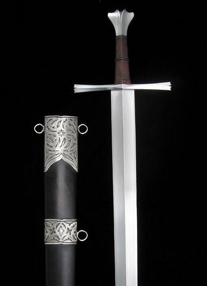
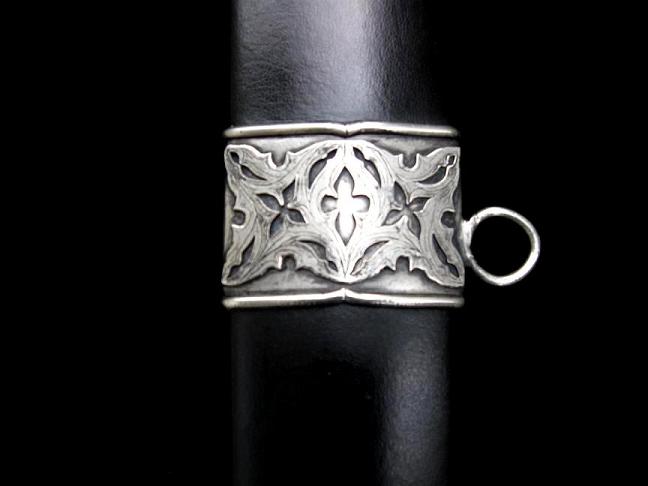
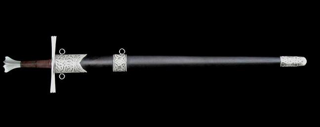
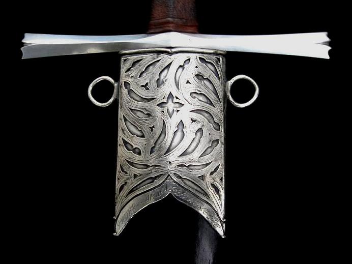
I was approached by Tom several months ago about a custom project for his Albion Burgundian. I wanted to keep with the late Gothic feel of this fine sword, and attempted several incarnations of this design. In the end this is what we ended up with. I am attempting some difficult designs way past my ability (sometimes to my detriment) .
Tom provided the scabbard, maybe he will chime in and share his thoughts as well.
I would love to get some feedback from the group on likes, dislikes, as I would like to do a few more of these.
Thanks
Sam
Attachment: 39.87 KB
Attachment: 19.53 KB
Attachment: 26.17 KB
Attachment: 16.08 KB
Attachment: 37.79 KB
Attachment: 11.12 KB
Attachment: 22.6 KB
[ Download ]
Last edited by Sam Haverkamp on Mon 30 Mar, 2009 6:20 pm; edited 1 time in total
|
|
|
|
Patrick Kelly
|
Posted: Mon 30 Mar, 2009 6:18 pm Post subject: |
|
|
Oh my. No dislikes from me, that's beautiful work. I can't wait to see the completed rig. Will you be doing a belt as well?
|
|
|
|
Nathan Robinson
myArmoury Admin
|
|
|
|
G. Ghazarian
Industry Professional
|
Posted: Mon 30 Mar, 2009 7:27 pm Post subject: |
|
|
Great work and excellent design Sam.
No dislikes from me neither.
May I ask what metal you are using ?
Gabriel
G. Ghazarian
http://gloryships.com/
|
|
|
|
D. Austin
Industry Professional
|
Posted: Mon 30 Mar, 2009 11:00 pm Post subject: |
|
|
Hi Sam,
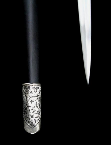
As one who loves to receive constructive criticism, I'd like to be the first to offer a "dislike" or two. The only aesthetic issue I have, is that perhaps the chape could be more pointy (following the lines of the blade more). Although having said that, it does look good. As for the rest of it, no aesthetic dislikes whatsoever. I love it.
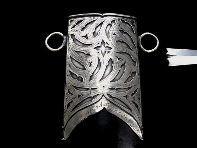
Without knowing how you constructed it, I'm slightly concerned that the rings could break with heavy use, especially as they appear to be either silver or copper, but I'm guessing that you've taken this into account. Overall, fantastic!!! I'm very impressed with both the design and the execution. Well done, as always.
Darren.
|
|
|
|
Peter Johnsson
Industry Professional
|
Posted: Mon 30 Mar, 2009 11:45 pm Post subject: |
|
|
Sam,
I think this is the best work I´ve seen from you.
The two layer method of applying decoration is very much according to style and done with feeling and elegance.
If I were to point at anything I would like to see another approach to it would be the Chape:
Perhaps if you did a solution where the decoration is not an applied shield, but covered the whole surface down to the point?
Imagine if the decoration "grew" out of the final point of the Chape, rather than "hung" on its front, like a shield on a wall?
Inspired work!
Thanks for showing :-)
|
|
|
|
Joel Chesser
|
Posted: Tue 31 Mar, 2009 12:46 am Post subject: |
|
|
Echoing others I also am very impressed, Fantastic work. I would say though that I agree with Mr. Austin in that I think a more pointed chape that followed the shape more closely would look better. Again, fantastic job.
..." The person who dosen't have a sword should sell his coat and buy one."
- Luke 22:36
|
|
|
|
Allen Foster
|
Posted: Tue 31 Mar, 2009 5:47 am Post subject: |
|
|
Anohter beautiful project Sam. You never cease to amaze me.
I think the shape of the chape to some extent is limited by the shape of the wood core if I'm not mistaken. The customer made it and could have wanted it that way. I love it anyways.
Allen
"Rise up, O Lord, and may thy enemies be dispersed and those who hate thee be driven from thy face."
|
|
|
|
Addison C. de Lisle
|
Posted: Tue 31 Mar, 2009 8:30 am Post subject: |
|
|
Very nice work; I enjoy how the pommel and the chape/locket complement each other without using the same motif. I think it suits the sword very well
My only point to nitpick about would be that the rings attached to the scabbard aren't completely circular, but I would guess that originals may not have been either, or that it was intentional.
www.addisondelisle.com
|
|
|
|
Brian K.
Industry Professional
|
Posted: Tue 31 Mar, 2009 9:18 am Post subject: |
|
|
Astounding work. Perhaps my Kingmaker should get the same treatment?
I really, really enjoy seeing your work Sam.
Brian Kunz
www.dbkcustomswords.com
|
|
|
|
Sam Haverkamp
Industry Professional
|
Posted: Tue 31 Mar, 2009 3:50 pm Post subject: |
|
|
Thanks everyone for the encouragement and candid feedback.
I had to pinch myself seeing a posting from Peter J. (Thanks Peter!)
I was trying to think about this project through his eyes and what might make sense for a High Gothic design that would flow with his hardware.
I agree with the Chape suggestion. There are a couple reasons, the scabbard is shaped liked that, and I burned up the point of the design on the first chape while brazing, so I decided to make it longer and give myself more room to braze and shape the end.
It looked fine when heavily blackened, but I do see how it looks odd now thats its been polished up.
Some of the other feedback was,
The rings are not quite round. (These are hand forged, and I actually liked the fact they they were not perfect, and In my eye matched the flow of the design)
Darren mentioned they may bend with heavy use. (I thought about this and did suggest they be allow to move, but this is based on a historical rig so they were made rigid.) I hope they will hold up, I cant bend them with my fingers at all.
Metal used (Copper and Nickel)
Hi Patrick, The customer, Thom R is a very talented craftsman himself, he will be rigging the belt and hanging.
Brian, Thanks Bud, I would be happy to :-)
Lastly, Thanks Nathan for the great forum that allows me to post my work. I really do appreciate all you do for us.
I will be donating a shield or something to the next fund drive, count on it!
Sam
|
|
|
|
|