| Author |
Message |
Nathan Robinson
myArmoury Admin


|
 Posted: Sun 30 Oct, 2005 5:01 pm Post subject: Testing a new forum layout Posted: Sun 30 Oct, 2005 5:01 pm Post subject: Testing a new forum layout |
 |
|
I've been playing with a new forum layout. I haven't decided if I want it to be permanent or not. This site is as much a developmental platform for me as it is anything else, so I thought I'd make it live for a bit. I know many of you despise change, and I apologize for that.
The direction I was going was to create a minimalistic layout that has more empty space and less clutter. I wanted to achieve this without reducing the amount of content on the screen. Most importantly, however, was my intention to fit more information in a smaller space. This new layout does all of those things, while reducing some immediate visual references that, I hope, aren't part a visitor's normal user experience, but rather part of their occasional experience.
The changes started with the Spotlight Topics area. This has been completely redone to make it far more useful and less cluttered than it was before.
The only other changes, currently, are the Forum Index and the list of topics within each forum.
 Attachment: 36.79 KB Attachment: 36.79 KB
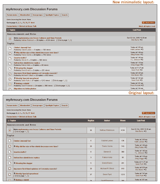
Forum List of Topics Comparison
Attachment: 40.66 KB
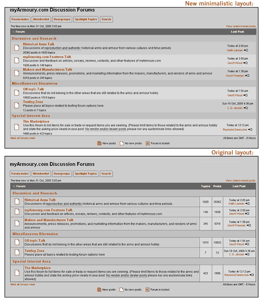
Forum Index Comparison
.:. Visit my Collection Gallery :: View my Reading List :: View my Wish List :: See Pages I Like :: Find me on Facebook .:.
|
|
    |
 |
Nathan Robinson
myArmoury Admin
|
|
|
|
|
Chad Arnow
myArmoury Team

|
| Posted: Mon 31 Oct, 2005 3:54 pm Post subject: |
|
|
:\
Call me a creature of habit, but I prefer the old way.
:)
ChadA
http://chadarnow.com/
|
|
|
|
|
Steve Grisetti

|
| Posted: Mon 31 Oct, 2005 3:55 pm Post subject: |
|
|
Looks fine to me. I was just a little alarmed, at first, thinking something was wrong with my old, not-so-faithful PC! :lol:
"...dismount thy tuck, be yare in thy preparation, for thy assailant is quick, skilful, and deadly."
- Sir Toby Belch
|
|
|
|
|
|
Aaron Schnatterly
|
| Posted: Mon 31 Oct, 2005 4:14 pm Post subject: |
|
|
I voted neutral, because the same info is there, and I'll get used to seeing it in a different way fairly quickly.
At the moment, I'm 55/45 in favor of the old way, simply because I found it easier to find topics I was hunting by scanning down that "thread initiator" column.
I do like the minimalistic view in the index, but not as much in the forums themselves.
-A
-Aaron Schnatterly
_______________
Fortior Qui Se Vincit
(He is stronger who conquers himself.)
|
|
|
|
|
|
Patrick Kelly
|
| Posted: Mon 31 Oct, 2005 4:46 pm Post subject: |
|
|
|
As long as it isn't because I pushed the wrong button I'm okay with it!
|
|
 |
|
Jean Thibodeau

|
| Posted: Mon 31 Oct, 2005 4:58 pm Post subject: |
|
|
I like the new way the spotlight topics are organized as it leaves lot of room for expansion. The old way was / is o.k. but was at the point were any new additions would have meant a lot of scrolling down in the near future.
I"m sort of in agreement with Aaron that the old way and the new give you about the same info.
Maybe an in-between solution giving the Topic subject in one column ( BOLD ? ) so that the eye can quickly scan down that column without the clutter of statistic, a second column with all the statistics, and the last with the most recent reply.
Either way works for me. Would avoid " really " small text for those statistics for us with old tired eyes. :p :lol:
You can easily give up your freedom. You have to fight hard to get it back!
|
|
|
|
|
Nathan Robinson
myArmoury Admin
|
|
|
|
|
|
Jonathon Janusz
|
| Posted: Mon 31 Oct, 2005 5:19 pm Post subject: |
|
|
I like bits of both layouts. The new one puts more content per page but the old one is, in my opinion, easier to read. One thing I wanted to point out is on the new layout - something with the new layout and the (current/old) title bar just doesn't feel right to me stylistically. Moving in the direction of the new layout might call for a little tweaking of the rest of the window dressing.
Part of the reason I bring this up is because this might not be such a bad thing. I have to say that, although very nice and by far and away better than what came before it, the new A&A site Nathan helped build has a lot of myArmoury "look and feel" going on. Not that this is bad (myArmoury has proven to be a well put together little machine), but I mention it only to keep in mind the desire to maintain myArmoury's unique identity in cyberspace. It is kind of looking at a collection of paintings by one artist - you can tell by subtle cues that the pieces go together (as in the same hand and vision painted them) but what makes each work a masterpiece is what makes it stand out unique among all the others.
|
|
|
|
|
Steve Maly

|
| Posted: Mon 31 Oct, 2005 5:30 pm Post subject: |
|
|
I prefer the more orderly nature of the original layout.
"When the only tool you own is a hammer, every problem begins to resemble a nail." ~A. Maslow
|
|
|
|
|
Michael F.

|
| Posted: Mon 31 Oct, 2005 5:41 pm Post subject: |
|
|
Interestiing new Layout. Though it does seem a bit cleaned up, there's all that nice open space right in the middle and the main forum page lacks those nice sorting lines. :) It's a tough one, but I voted for the old layout.
"Tis but a scratch.....A scratch? your arm's off!"-- Monty Python and the Holy Grail.
|
|
|
|
|
Nathan Robinson
myArmoury Admin
|
| Posted: Mon 31 Oct, 2005 6:07 pm Post subject: |
|
|
Well, I used the new test layout for awhile and came to the conclusion it needed changing. Like Aaron, I felt a combination of the original and simplified layouts would be the best direction. I've removed the voting poll from this topic, as it's not valid any longer. I've also updated the layout to reflect this new direction.
Your continued input is welcome.
I still like the idea of the simplified layout, but as Jonathon suggested, I felt it didn't fit within the rest of this site's design. It would better fit into a fully minimalistic site with a lot of negative space and a less heavy overall header. The forum keylines simply didn't work with the super-simplified inner content. I'll save that design for another project.
.:. Visit my Collection Gallery :: View my Reading List :: View my Wish List :: See Pages I Like :: Find me on Facebook .:.
|
|
|
|
|
M. Taylor

Location: Chesterland, Ohio Joined: 01 Mar 2004
Posts: 128
|
| Posted: Mon 31 Oct, 2005 7:24 pm Post subject: |
|
|
I like how it looks; at least how it looks as of 10:20 PM EST. :) I like how the spotlight topics are displayed now. Change can be a good thing. Thanks, Nathan.
"Only people not able to grow tall from their own efforts and achievements seek to subdue their fellow man."
"Only people not being able to find comfort in their own mind seek to silence others. " - Per Bylund
|
|
|
|
|
William Goodwin

|
| Posted: Tue 01 Nov, 2005 3:21 am Post subject: |
|
|
Always under the yoke of simple is better (in most cases). This looks fine and may prove to be
an asset in the future, plus this site is your baby Nathan, so, have a go with what you feel would be best.
Thanks for the extra work in striving to make this place even better.
Cheers,
Bill
Roanoke Sword Guilde
roanokeswordguilde@live.com
"I was born for this" - Joan of Arc
|
|
|
|
|
|
Aaron Schnatterly
|
| Posted: Tue 01 Nov, 2005 2:06 pm Post subject: |
|
|
|
Like the hybrid, Nathan - cleans it up, but leaves references readily at hand that I did commonly use.
|
|
|
|
|
|
S Ott
|
| Posted: Tue 01 Nov, 2005 6:30 pm Post subject: |
|
|
|
I like the original style as well.
|
|
|
|
|
Michael Sigman
Industry Professional

Location: New Glarus, WI Joined: 18 Aug 2003
Posts: 275
|
| Posted: Fri 04 Nov, 2005 9:50 am Post subject: |
|
|
Nathan~
I was curious about an option. Is there a way that you an add something that says when the post originated? Sometimes it would be nice to see the date that the thread started without going into the post.. Just curious is all. :D
Mike Sigman
Albion Swords
|
|
|
|
|
|
|