Just finished: a shield
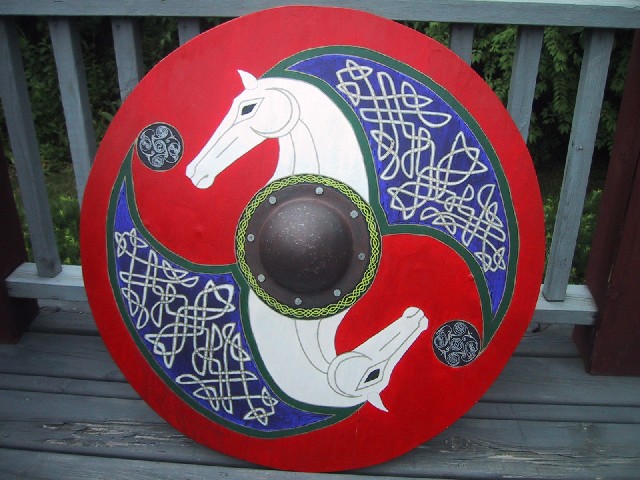
I've been working on this shield off and on for about two years now (using power tools in a campus apartment is generally frowned upon for some reason). It is a poplar plank construction with no rim or covering. I know its not really accurate or anything but it is supposed to kind of be a Rohanic design so take that for what its worth.

I drew my inspiration from several sources including the movies, La Tene artwork, and just myself.

I had the most trouble with the boss. I eventually settled on browning it and then lightly sanding it to produce a sort of used look.

Its not really finnished and I dont expect it ever will be. I have grown rather frustrated with it and might one day take the boss off to use on a different better version of this shield as this one didn't turn out as well as I wanted it to.


 Attachment: 94.73 KB
a shield 1.jpg

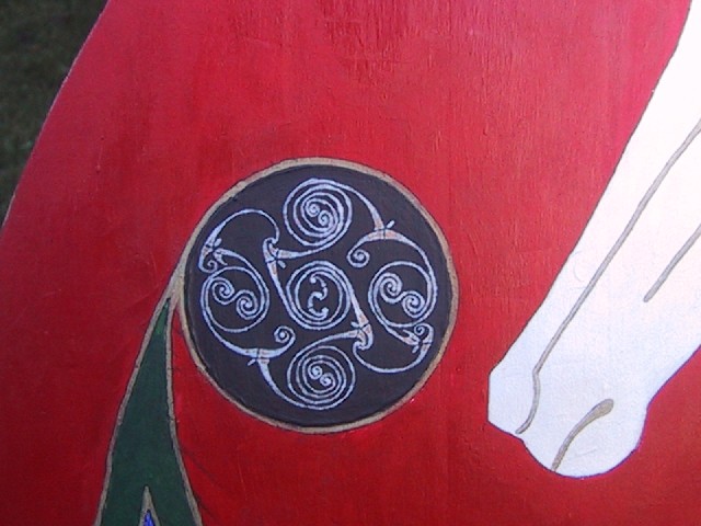
here is a close up of the spiral


 Attachment: 70.93 KB
a shield 2.jpg

I particularly appreciate the knotwork, Joe! Nice detail.

Working in a campus environment is a bit of a bugger. I've been known to do some of that myself, or in hotel rooms, too... We just gotta do what we gotta do.
lol, thats true enough. I had paints all over the place and my apartment mate just rolled his eyes when he walked by me. haha
oo, interesting note here. The white paint I used for the horses is actually a shimmering pearl color so it has a certain luster that makes it stand out from the rest..... not that you can see that in the photo at all at all.
Looks good to me. Exactly what about it are you dissatisfied with?
What's it made from? Plywod? (we use plywood for most of our shields, seeing as they are bound for gradual destruction by blunt metal impliments anyhow...)
I'm asking because quite a few Viking reenactors around here make fake "boards" on the front of the shield, to make it look more authentic. Personaly, I find this a bit silly, because a propper shield would either be covered by leather or cloth, or put togehter in such a fashion that the individual boards did not show under the paint...
Quote:
Exactly what about it are you dissatisfied with?


Exactly my question...
Can you tell what style/example is your goal and what feel you were aiming at?
Can you post some examples? maybe then whe can help you out a little.

Maybe one thing to start with is the fact that you used three different styles of designs...
All three by the way, are verry well executed!! :D
But the problem is (I think) that it makes it look a bit (how sall i put it?) a miss mass...

Not what you would expect from a shield that (to my opinion) would need a stout and bold impression,
that would be visible from the other site of the battlefield, if you know what I mean.

Yust my two cents....

Folkert.
Looks great to me at least as artwork not meant to be historically accurate: Perfectly fine as a phantasy piece.

A metal rim might be nice. As to satisfaction with this shield I guess it depends on what you want it to be !

If one makes a shield for actual use in regular practice with sword and shield one might make something very easily repairable and disposable with a simple to repaint design if one wishes to give it a bit of style.

What you seem to have is a purely decorative piece that is marginally usable maybe once and much too attractive to risk damage.

I can also see one making an extremely well decorated shield that would be fully functional and sturdy that could be used in real ( Historically ) or simulated combat but where one would use the above practice shields to keep this one in as new condition. ( Could be used, but wouldn't be used in a modern context. Historically highly decorative pieces would be used with little concern about damage in a real battle I think. )

Structuraly I would want a strong boss and metal rim ( The metal rim maybe covered with rawhide: Don't know if this was actually done, the point being to get the strenght of the metal reinforced edge plus the gripping effect of the rawhide rim to catch the edge of an opponents sword putting it out of action for a short time. )

Also a strong fabric or leather covering, unless it was an all metal 16th century Rondache or Target.
Hey guys,

Its not really the style or mesh of styles that got to me it was actually jsut making the whole thing. I'm a bit of a perfectionist and as this was my first attempt at a shield there were naturally quite a few mistakes that I made which i wont make again but the damage has already been done. Cosmetically its fine. I would have like to have put a rim on it (leather for sure) but I've started to think how i could do it better. A cleaner weave in the mane comes to mind, more accurate construction. I know it is just an art piece, not a recreation of a real viking shield but thats a pretty bad excuse to let things slide i think (i know many of you can agree with that).

This wasnt meant to be a gipe or anything but anyone who has ever made anything knows what they could have done in hindsight to make it better. As far as this was my first shield, I'm pretty pleased with it all in all. But i know i can do better.

Elling- It is made from planks of poplar that i joined together using Gorilla Glue and a biscuit joiner for added strength.

Thanks for looking guys :D
Your knotwork is fantastic, at least to me anyway though I am no expert. I think you did a great job on your artwork. Personally, I think you should give yourself more credit. Regards,
Joe Yurgil wrote:
...I'm a bit of a perfectionist....

This is all that prevents you from being totally satisfied with the shield. I think it looks great. As someone else noted, the knotwork is especially nice.
Joe Yurgil wrote:
This wasnt meant to be a gipe or anything but anyone who has ever made anything knows what they could have done in hindsight to make it better. As far as this was my first shield, I'm pretty pleased with it all in all. But i know i can do better.


Oh man, do I know this feeling. The learning curve is amazing, but skills improvement and results are impressive as well. We all tend to be either hyper-critical of our own work, or blind and defensive (fortunately less common). I personally like this piece, but can see where you've pointed out improvements for your next project that are very reasonable.

One thing I mentioned strongly in my threads on my early scabbards is that you just have to be willing to try, and start again if it all gets messed up - but learn rather than give up, and try to laugh instead of throw stuff. Do the best you can, and expect to learn some (or a ton) along the way. It's all doable. In my case, I am now taking on commissions for custom scabbards, and have 3 in progress now, with a few more in the plannng/discussion stages.
Yeah, that is so true. Even though i got frusterated with this one i cant wait to start the next as it really was fun to work on and i know the next one will be even better. :D :cool:
Apart from the learning experience in making a shield you have made a very nice piece of ART and even if you discount it as a functional or potentially functional shield you should be proud of it.
Joe Yurgil wrote:
Yeah, that is so true. Even though i got frusterated with this one i cant wait to start the next as it really was fun to work on and i know the next one will be even better. :D :cool:


Though I don't feel that way while I'm actually frustrated, the fact that I am means I am pushing my limits. It's part of the process for me... if it isn't there to some minor degree, at least, I'm not doing my best work.

Jean Thibodeau wrote:
Apart from the learning experience in making a shield you have made a very nice piece of ART and even if you discount it as a functional or potentially functional shield you should be proud of it.


I agree with this - the pics really are nice. Cherish the talents you have, develop the ones that aren't quite there yet... and stop short of throwing stuff. :p

Can't wait to see the next one!
If I may be blunt Joe, lighten up man the shield looks great!
Re: Just finnished: a shield
Joe Yurgil wrote:
I've been working on this shield off and on for about two years now (using power tools in a campus apartment is generally frowned upon for some reason). It is a poplar plank construction with no rim or covering. I know its not really accurate or anything but it is supposed to kind of be a Rohanic design so take that for what its worth.

I drew my inspiration from several sources including the movies, La Tene artwork, and just myself.

I had the most trouble with the boss. I eventually settled on browning it and then lightly sanding it to produce a sort of used look.

Its not really finnished and I dont expect it ever will be. I have grown rather frustrated with it and might one day take the boss off to use on a different better version of this shield as this one didn't turn out as well as I wanted it to.


It's the first time that I've looked at the thread, but if I might say... Nicely done! Keep up the good work and I expect that before you know it people will be asking you to build sheilds for them! :)
Thanks for the comments guys, im glad you like the shield even though it isn't the most historical design. :D I will (of course) keep you all posted on later developments. :cool:

Page 1 of 1

Jump to:  
You cannot post new topics in this forum
You cannot reply to topics in this forum
You cannot edit your posts in this forum
You cannot delete your posts in this forum
You cannot vote in polls in this forum
You cannot attach files in this forum
You can download files in this forum


All contents © Copyright 2003-2006 myArmoury.com — All rights reserved
Discussion forums powered by phpBB © The phpBB Group
Switch to the Full-featured Version of the forum