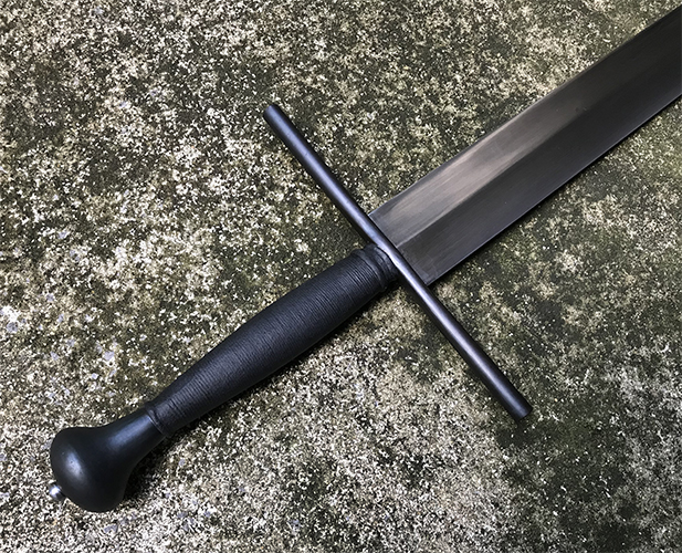
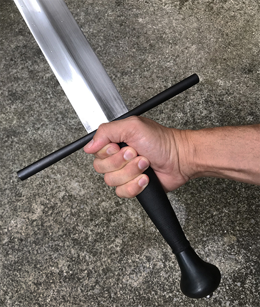
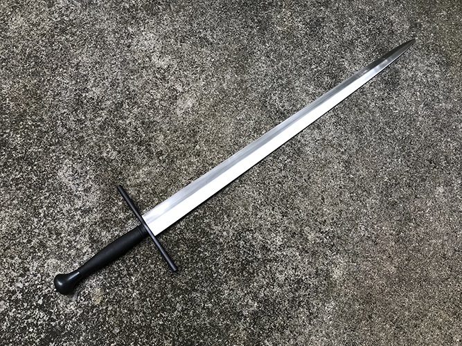
I’m losing track, but I think this is the third sword I’ve built using the Windlass “Erbach” blade. This one could have been lots of things 1450-1550, but it insisted on being this austere weapon in the style of ca. 1510-1525. I wasn’t aiming for the wonderful Dresden sword https://myArmoury.com/talk/viewtopic.php?p=25055 but that sword certainly is a favorite of mine, so there’s undeniable influence here.
The pommel was an old rough casting from A&A that needed drilling, polishing and repair of some pits. I made the cross from a discarded test tube stand.
As this developed as a very severe-looking sword, I decided to leave the furniture relatively roughly finished and blue it in that state. That, plus a beeswax finish, gives a finish that looks more like fire bluing than I’ve seen in my previous applications. If you’d like to try that, beware of the wax–be sure you have everything exactly as you want it before waxing because it’s tough to remove for later applications of chemical bluing. You’ll need to heat the piece with a torch to burn off the wax, then use a strong engine degreaser.
I typically blue the peen nut and peen, but for some reason felt that they should be bright here to relieve the darkness. Maybe I'll change my mind.
I didn’t make a scabbard because I thought this might be displayed bare and blade-up. I might revisit that idea and make a scabbard and byknives like the Dresden scabbard.
Attachment: 426.15 KB
Attachment: 424.34 KB
Attachment: 341.25 KB
I like it....I like it a LOT. :D That's a fighting man's sword. :cool: .........McM
I'm sure it would impact the bluing and whatnot, but have you thought about filing and flaring the ends a little bit, and giving it a similar distal-quillon S-curve seen on the Dresden example? I feel like it would spice up the otherwise somewhat bare looking cross and integrate better with the volute on the pommel... Just my opinion though, and I don't know beans.
There's a very slight trumpeting effect due to spreading the middle of the guard and filing/grinding, but I, too, would have liked a more pronounced waist for the guard. One of the early ideas was for something of the previous century, and the guard would have been a better match there.
Fantastic work as always, Sean.
This is one of my reference images.
Attachment: 84.09 KB
[ Download ]
Attachment: 84.09 KB
[ Download ]
Page 1 of 1
You cannot post new topics in this forumYou cannot reply to topics in this forum
You cannot edit your posts in this forum
You cannot delete your posts in this forum
You cannot vote in polls in this forum
You cannot attach files in this forum
You can download files in this forum
All contents © Copyright 2003-2006 myArmoury.com All rights reserved
Discussion forums powered by phpBB © The phpBB Group
Switch to the Full-featured Version of the forum
Discussion forums powered by phpBB © The phpBB Group
Switch to the Full-featured Version of the forum