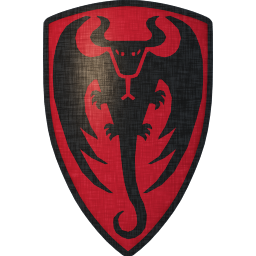
I designed myself a heraldic emblem of dragon to be used on a shield. I would be interested in hearing what do you think about it.
 Attachment: 65.79 KB


| Walter S wrote: |
| I designed myself a heraldic emblem of dragon to be used on a shield. I would be interested in hearing what do you think about it. |
Ah... The old BullWorm emblem. It looks great. I've tried to design a logo for my sword group on several occasions but I have no artistic talent or any sense for graphic design software.
Looks pretty cool to me!
i love it - cheers
Love it and it also sort of has a bat like look plus a little bull mixed in. :cool:
I also like it just as a drawing and design: Nice use of positive and negative space i.e. good composition very aesthetically pleasing. :D :cool:
I also like it just as a drawing and design: Nice use of positive and negative space i.e. good composition very aesthetically pleasing. :D :cool:
I'll go against the grain and say that while I like it from an artistic and coolness standpoint, it has a look that is more modern than historical. So if your intent was something that wouldn't look out of place in reenactment, etc., this might not work. For display or to carry around the faire, it's great. :)
It's still much better artwork than I could come up with!
It's still much better artwork than I could come up with!
| Chad Arnow wrote: |
| I'll go against the grain and say that while I like it from an artistic and coolness standpoint, it has a look that is more modern than historical. So if your intent was something that wouldn't look out of place in reenactment, etc., this might not work. For display or to carry around the faire, it's great. :)
It's still much better artwork than I could come up with! |
You are right, it doesn't have the feel of period art, however that was sort of the point. I might try to make more period looking version too - probably with the dragon dexter segreant and with more "curly" lines.
For a black beast I'd choose a white or yellow backgroud,just to keep it within the rules of blazon, which state "no colour upon colour, no metal upon metal" -a matter of contrast. This would make it look more historical. But... it is your shield, it's up to you.
| Daniel Patrick O'Brien wrote: |
| ...the rules of blazon... |
Do you have more information on these rules? As a graphic designer I too have dabbled in my own heraldry and would welcome information that lays out guidelines historically.
| Richard Schneider wrote: | ||
Do you have more information on these rules? As a graphic designer I too have dabbled in my own heraldry and would welcome information that lays out guidelines historically. |
I have many books in my reading list that cover basic heraldry. Most are inexpensive and worth a read. The rules vary by continent, country, region and century. There used to be some freeware on the web for basic heraldry, I'm not sure if the site is still up or not. As a side note, there is a graphic designer who makes a profit by turning out high quality devices for people.
Thanks for the info Scott.
| Daniel Patrick O'Brien wrote: |
| For a black beast I'd choose a white or yellow backgroud,just to keep it within the rules of blazon, which state "no colour upon colour, no metal upon metal" -a matter of contrast. This would make it look more historical. But... it is your shield, it's up to you. |
That is not necessarily true in this case - outside of western Europe, sable/black is sometimes considered fur and can be placed on gules/red. For example as on flag of Albania.
| Richard Schneider wrote: |
|
Do you have more information on these rules? As a graphic designer I too have dabbled in my own heraldry and would welcome information that lays out guidelines historically. |
You can also find quite a bit of information about heraldry on wikipedia.
| Scott Hrouda wrote: | ||||
I have many books in my reading list that cover basic heraldry. Most are inexpensive and worth a read. The rules vary by continent, country, region and century. There used to be some freeware on the web for basic heraldry, I'm not sure if the site is still up or not. As a side note, there is a graphic designer who makes a profit by turning out high quality devices for people. |
I have used this one, which just runs on java and doesn't require any installs (if you have java, of course):
http://www.inkwellideas.com/coat_of_arms/free_coads.shtml
I have not used it extensively, but enough to come up with my own heraldry, and general poke-around-ness. I also like that it uses some of the heraldry terms when picking out the charges, colors, and such.
Great graphic image, but as has been said before, a little modern for re-enactment, but great for faires, etc...
It *did* however remind me of the Bacardi logo...
 Attachment: 59.58 KB

It *did* however remind me of the Bacardi logo...

The Bacardi Bat?
Page 1 of 1
You cannot post new topics in this forumYou cannot reply to topics in this forum
You cannot edit your posts in this forum
You cannot delete your posts in this forum
You cannot vote in polls in this forum
You cannot attach files in this forum
You can download files in this forum
All contents © Copyright 2003-2006 myArmoury.com — All rights reserved
Discussion forums powered by phpBB © The phpBB Group
Switch to the Full-featured Version of the forum
Discussion forums powered by phpBB © The phpBB Group
Switch to the Full-featured Version of the forum